Arryved Portal Dashboard Overview
What Is The Arryved Portal Dashboard?
The homepage of your Arryved Portal is known as the Dashboard. It shows a visual summary of your business’s sales and tab data from the current day or a previous day.
Prerequisites
To view the Dashboard in Arryved Portal, the employee logged in must be a Portal Super Admin or an Admin with one of the following Portal Permissions:
DASHBOARD
ALL ACCESS
FULL ADMIN
Limitations
By default, the Dashboard shows information from the current day even if your business is not in service that day or hasn’t opened yet. If no data is available, the information will be blank or zero. However, you can change the date of the Dashboard’s view.
How It Works
Dashboard Calendars
Use the Change Date calendar to change the view of the Dashboard to any date you desire. The main data shown on the Dashboard will be from the date you choose, or if no date is chosen, the default is the current day.
Use the Compare To calendar to compare your Dashboard data to another day. You can compare a date to the same date of the previous year, or the same day of the week from the previous week, whatever you’d like! The comparison data will be shown under the main data in smaller green or red text, red showing negative data.
Top Metrics
(1) Tab Total
The Tab Total equals the total dollar amount in sales of all closed tabs.
Tab totals include (Subtotal - Comps) + Sales Tax + Use Tax + RSFs + Donations
Tips are not included in tab totals.
(2) Tabs / Guests
The 'Tabs' number on the left is the total number of closed tabs for the day.
The 'Guests' number on the right is an estimate of the total number of guests on those closed tabs.
If using seat numbers on a tab, each Seat Number will be counted.
Staff can also add a guest count to a tab by tapping on the tab in Arryved Service, then tapping the Guests button from the Running Tab window and entering the number of guests ordering on that tab.
If both Seat Numbers and a Guest Count were used, this data will use the higher count.
If neither action is taken, the system will count 1 guest to 1 tab.
(3) Check vs. Spend
The Check number on the left shows the average dollar amount of closed tabs across the establishment.
Tab totals include (Subtotal - Comps) + Sales Tax + Use Tax + RSFs + Donations
Tips are not included in tab totals.
The Spend number on the right shows the average tab dollar amount (Check) divided by the guest count. This is how you can see the average dollar amount a guest spends in your establishment.
(4) % FOH of Tabs
This field is great for tracking your labor spend. It takes your total tab sales for the day and divides that by your labor spend for Front of House Employees.
Sales include tab totals with (Subtotal - Comps) + Sales Tax + Use Tax + RSFs + Donations
Tips are not included in tab totals.
FOH employees are determined by your Labor Role Types.
(5) % BOH of Tabs
This field is great for tracking your labor spend. It takes your total tab sales for the day and divides that by your labor spend for Back of House Employees.
Sales include tab totals with (Subtotal - Comps) + Sales Tax + Use Tax + RSFs + Donations
Tips are not included in tab totals.
BOH employees are determined by your Labor Role Types.
(6) Hottest Seller
The Hottest Seller is your most ordered Inventory Item for the day. Unit Sizes are each counted separately.
Activity (Location Statistics)
(1) Item Sales
The Item Sales circle chart is a visual representation of your Inventory sales. As you hover your cursor over each piece of the chart, the label and data shown on the bottom left of the chart will change to represent that piece of information.
The very center of the chart will show Total Item Sales before Comps.
The next layer outward from the center are your Categories. Categories are preset by Arryved, and applied to your unique Item Types.
The next layer outward from Categories are your location’s Item Types.
The next layer includes all of your Inventory Items sold within those Item Types.
The last and most outward layer includes all of the Unit Sizes sold for those Inventory Items.
Depending on where you hover your cursor, you can see sales data for a certain Category, Item Type, Inventory Item, or as specific as the Unit Size of an item.
(2) Tab Migration
The Tab Migration circle charts shows Sales totals from each Venue and shows how tabs move from one Venue to another. Hover over parts of the chart to see Sales totals from tabs that only ordered from one Venue or from tabs that hopped from one Venue to another and placed orders in each.
(3) Sales Performance
Sales Performance is a visual representation of Sales totals within the Item Type Categories. Categories are preset by Arryved, and the appropriate Category is applied to your unique Item Types.
Hourly Sales Data
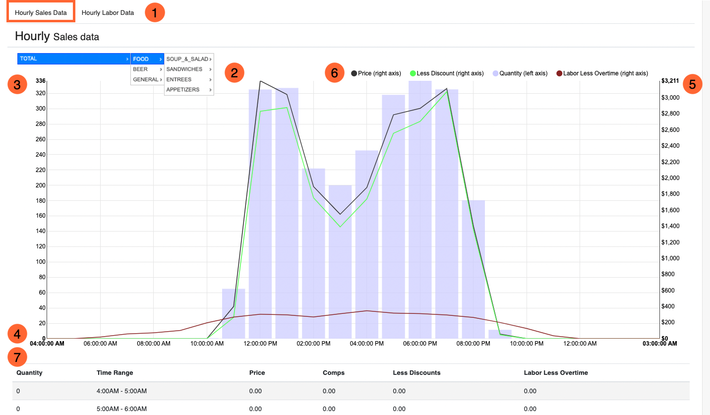
The Hourly Sales Data graph gives you a quick peek at how your business is doing for the day, hour by hour. The graph compares Sales to Labor spend.
(1) Toggle
In the Hourly section of the Dashboard, you can toggle between Hourly Sales Data and Hourly Labor Data. This example graph above is toggled to show Hourly Sales Data.
(2) Filter
With this graph filter, you can see data on specific Categories, Item Types, Inventory Items, or as specific as the Unit Size of an item. Hover over the right facing arrows to keep expanding more narrowed down filter options, or click on any word to apply that filter.
(3) X Axis Left
Numbers on the left side axis express quantity in regards to Labor Hours.
(4) Y Axis
The Y axis along the bottom is showing time of day hour by hour from 6:00 am to 3:00 am the next day.
(5) X Axis Right
Numbers on the right side axis express total dollar amount in regards to Labor Cost or Sales.
(6) Legend
Use the Legend to see what the lines and bars represent in the graph.
The purple vertical bars represent the total quantity of Labor Hours of clocked-in employees per hour. Look to the left axis for total quantity.
The maroon line across the bottom represents total Labor Cost in dollars not including overtime. Look to the right axis for the total dollar amount.
The top most dark purple line represents total sales including (Subtotal - Comps) + Sales Tax + Use Tax + RSFs + Donations. Comps are not taken into consideration. Look to the right side axis for total Sales.
The green line just below it is the same as above minus Comps. Look to the right side axis for total Sales minus Comps.
(7) Table
The table below the graph shows the same details in the graph but lists out the data by each hour.
Quantity = Number of Tabs closed out within that hour.
Time Range = One-hour timestamp.
Price = Total Sales pre Comps.
Comps = The total dollar amount in Comps.
Less discounts = Total Sales minus Total Comps.
Labor Less Overtime = Total Labor Hours minus Total Overtime Hours (quantity).
Hourly Labor Data
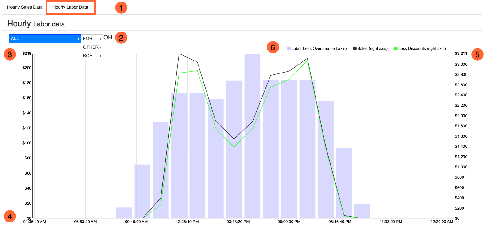 (1) Toggle
In the Hourly section of the Dashboard, you can toggle between Hourly Sales Data and Hourly Labor Data. This example graph above is toggled to show Hourly Labor Data.
(2) Filter
With this graph filter, you can see data on specific Labor Role Types such as Back of House or Front of House. You can also filter by specific Labor Role. Hover over the right facing arrows to keep expanding more narrowed down filter options, or click on any word to apply that filter.
(3) X Axis Left
Numbers on the left side axis express the total dollar amount in Labor Cost.
(4) Y Axis
The Y axis along the bottom is representing the different “shifts” worked throughout the day based on clock-in times.
(5) X Axis Right
Numbers on the right side axis express total dollar amount in Sales.
(6) Legend
Use the Legend to see what the lines and bars represent in the graph.
The purple vertical bars represent the total dollar amount of Labor Costs of clocked-in employees. Look to the left axis for total cost.
The top most dark purple line represents total sales including (Subtotal - Comps) + Sales Tax + Use Tax + RSFs + Donations. Comps are not taken into consideration. Look to the right side axis for total Sales.
The green line just below it is the same as above minus Comps. Look to the right side axis for total Sales minus Comps.
Related Articles
Related Articles
Daily Sales Report Overview
What Is The Daily Sales Report? The Daily Sales offers a detailed list of all closed tabs from the date or range of days the report is showing. The tab information includes the date and time, employee name, Venue, a breakdown of the tab total, and ...Arryved Portal Permissions Overview
What Are Portal Permissions? There are 29 different Portal Permissions that provide Employees access to certain functionalities in Arryved Portal. Portal Permissions can be added to Employees individually from their Portal profiles. This article will ...Sales Summary Overview
What Is The Sales Summary? The Sales Summary provides a quick overview of your business’s bookkeeping for the current business day. The report can be viewed on a past date or range of days as well. The Sales Summary includes a breakdown of revenue, ...Rosie Reports Overview
What Are Rosie Reports? Rosie is Arryved’s trusted office robot! Rosie sends a morning email of your locations’ Sales Summary from the preceding day as well as other helpful reports. Rosie can also send you any report of your choosing at any cadance. ...Arryved Insider Overview (For Merchants)
What Is Arryved Insider? Arryved Insider isn’t just a loyalty program, it’s so much more! It’s your solution for driving traffic, engaging guests, and building loyalty in your community. Integrated with your Arryved POS, Insider provides flexibility ...